 React Finland
Case Study — React Finland Website
A website is often the primary entry point of people to a conference. For this reason, it is important to get it right as it a significant part of the brand identity. Essentially a good website should communicate what the event is about in a way that’s pleasant and consistent with the purpose of it.
For this reason, it is important to get both the content and the design right. In this post, I will highlight how we achieved it in the case of React Finland (24–26.4.2018, Helsinki) website.
Content is About Communication#
When I began to develop the site, I put most focus on the content and copywriting. I wanted to communicate what the conference is about and design came more as an afterthought.
The site would have benefitted from a designer early on but having content was a starting point. No amount of design can make up for lacking in this department.
After I had the initial copywriting done, I began to work on the site structure and figured out the basic concepts (schedule, speakers, workshops, and so on). The process became valuable later on as I modeled a data schema for the GraphQL API of the event.
To see how the content looked originally, see early revisions of the site: [1], [2], [3], [4]. Read Technology behind React Finland for the technology choices.
One of the early designs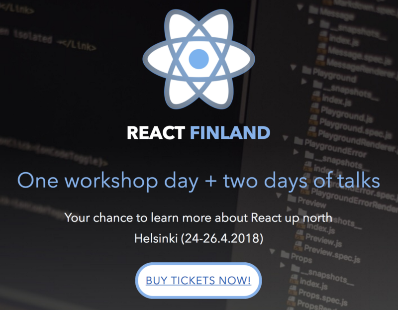
Design is About Presentation#
Although a site can be structured well and filled with good content, if the design is poor, you might lose people. A design can be seen as the means in which your content is presented to the users. It’s the touch and feel of the site so to speak and it also communicates something about your brand.
In the case of React Finland, we wanted to integrate the idea of Finland to the site somehow. Finland Toolbox, the official brand identity of Finland, was invaluable here. It was about fusing the toolbox with our ideas and our content that gave the final result.
Redesigning react-finland.fi#
I realized during early January that although the conference is selling quite well, it could do better if we improved the design of the site.
As I happen to know Andrey Okonetchnikov, a very good designer/developer, I decided to employ him for two days.
We sat down together, designed a brand identity and implemented it. Some of the work was completed later but we finished majority of the work by working in tandem and it was fast for us to resolve issues as we encountered them.
As it happens, this was an excellent decision as illustrated by the sales graph below:
The conference sold well in the beginning, after re-design (middle), and the end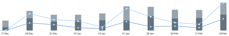
You can see three distinct peaks. Incidentally, one is exactly after we re-designed the site. The work made the site, and as a result the conference, more credible.
I believe this collaboration made a significant impact on the conference. It is one of the primary reasons why the conference will be sold out in its first iteration and most importantly it gave React Finland a strong visual identity for years to come.
See Andrey’s post Redesigning react-finland.fi to gain his perspective on the topic. To see how the design work progressed, see [1], [2], and the final result.
The resulting design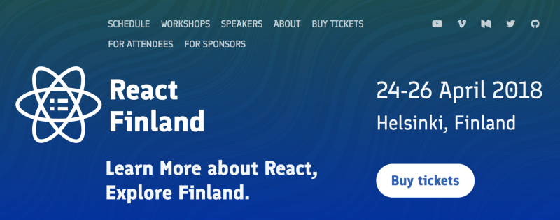
Conclusion#
Although React Finland site is quite small, it has been a great case for me to work on as it’s more than only the technical part. It was nice to see how different disciplines can go smoothly together and amplify each other when applied carefully. Design supports development, marketing, and sales efforts. All of this more than paid for the investment we made into design.